Case study · Paira · AI-powered matching app
Mobile App Dev
Client
Paira
Industry
Social networking · AI
Services
Product architecture, UX/UI design, design system, handoff & iteration
Scope
Start-up 0→1 · iOS
Live site
waitlist.paira.org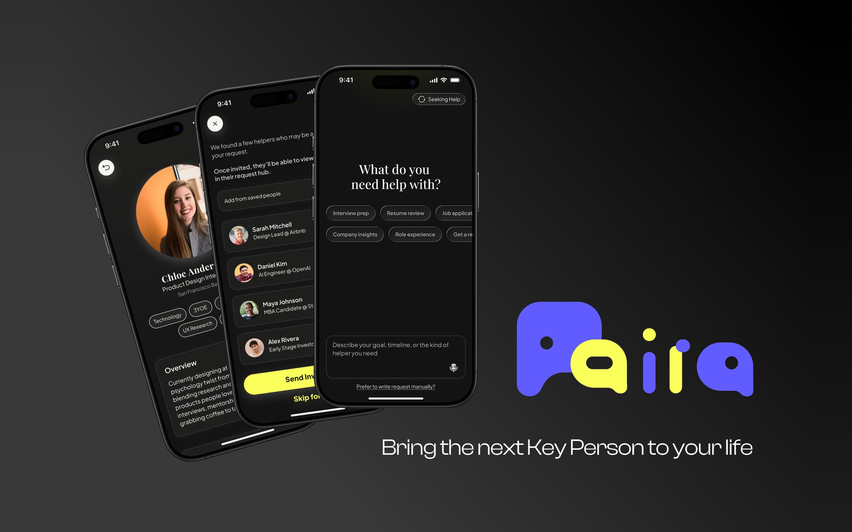
(01) Overview
From a concept to a market-ready app.
Post a request with AI
The flagship flow. One tap on the yellow button, a few chips, and the assistant turns a vague ask into a posted request with the right people already invited.
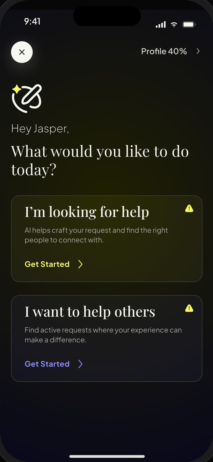
01 · Choose an intent
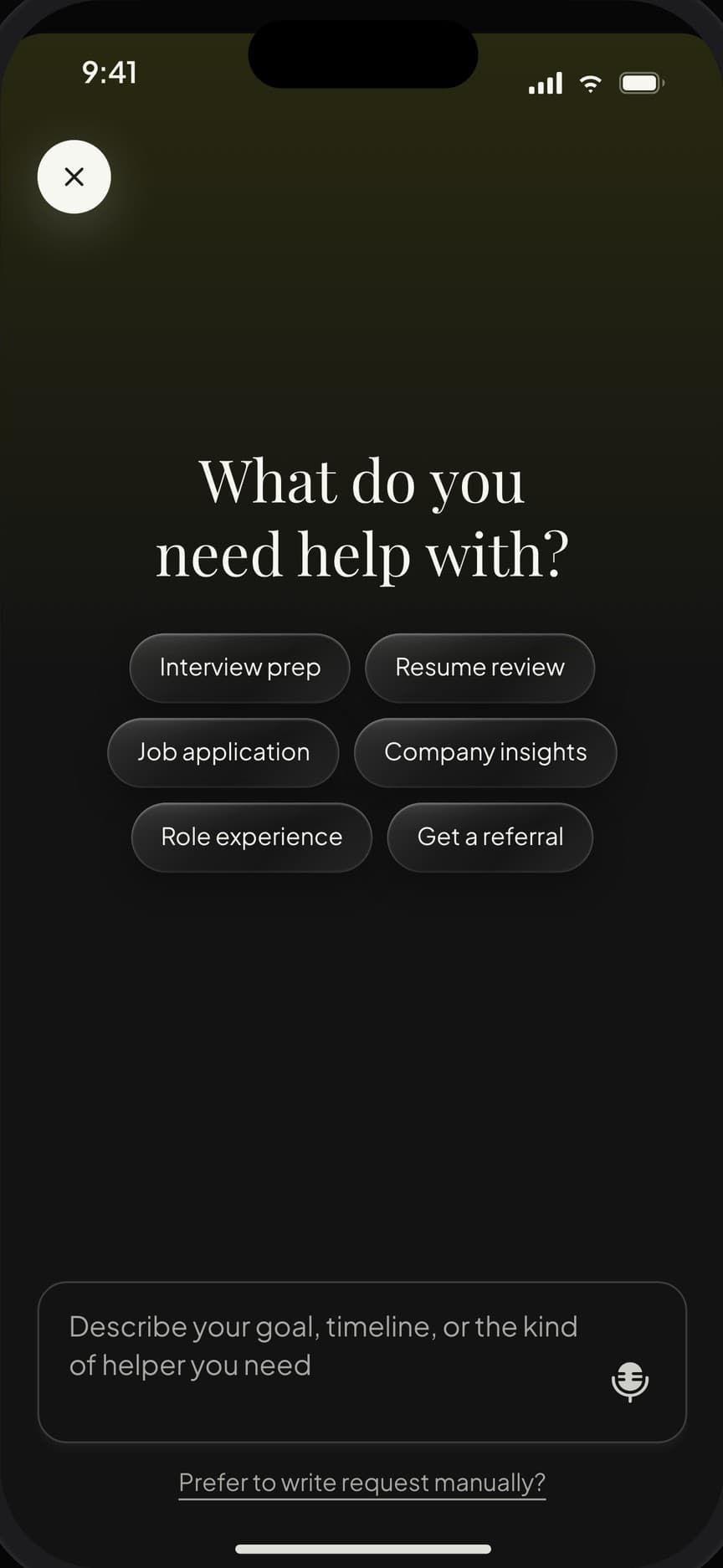
02 · Say what you need
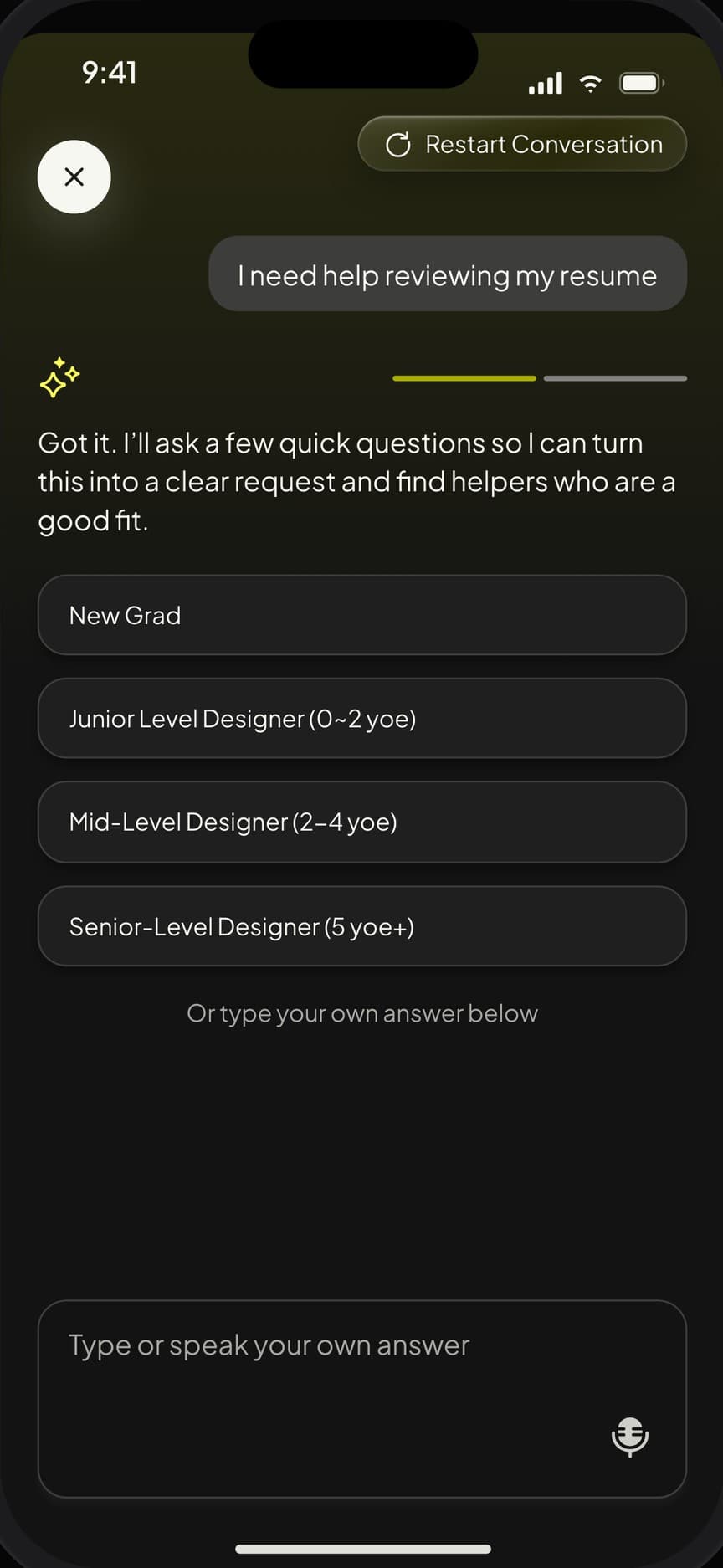
03 · Answer three quick questions
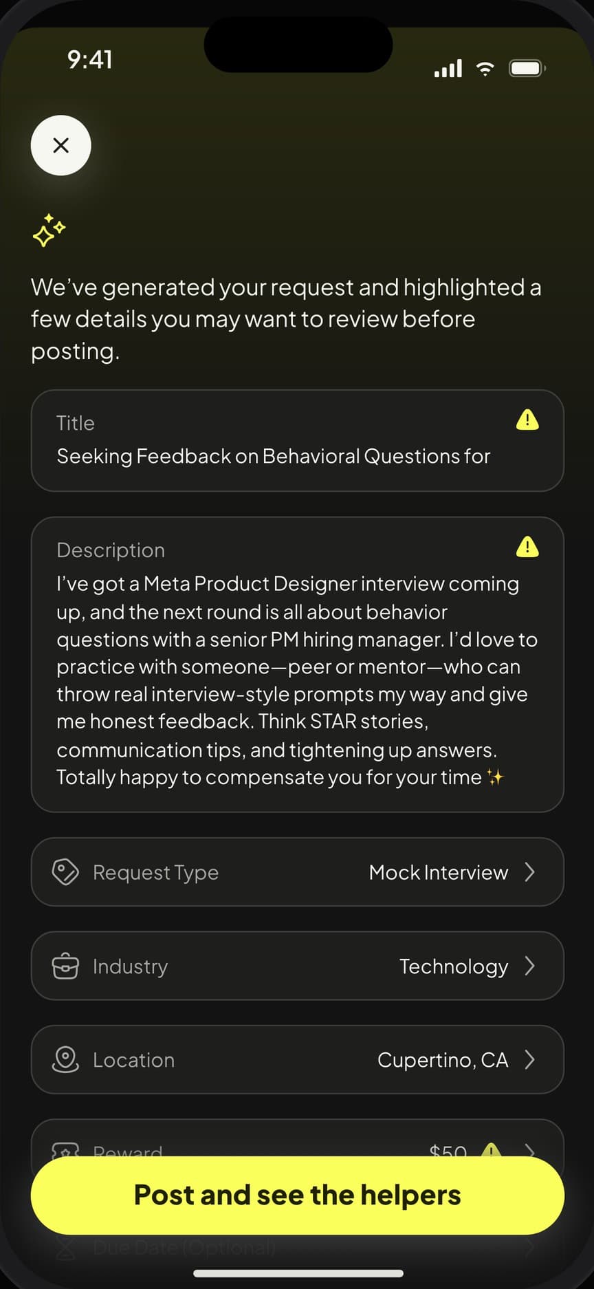
04 · Review the drafted request
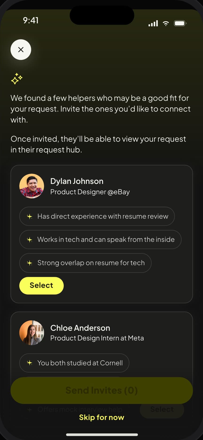
05 · Meet the matched helpers
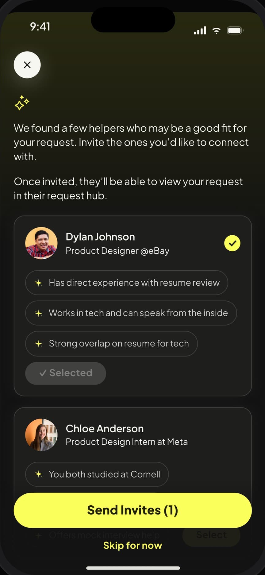
06 · Invite them in one tap
(02) Challenge
Make an AI conversation feel like the product, not a feature.
(03) Approach
Architecture first, then every screen.
(What we did)
- Product architecture
- User flows
- AI conversation UX
- Profile & request design
- Visual language
- Component library
- Prototype
- Engineering handoff
The rest of the product
Four tabs around the assistant: your requests, daily picks to help with, conversations and meetings, and a profile that earns points.
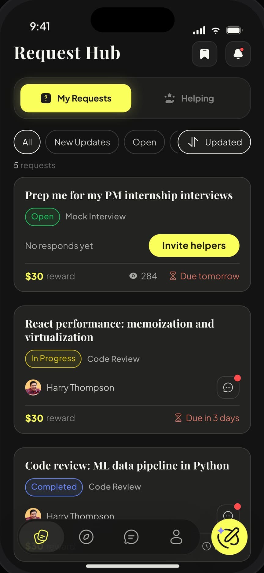
Request Hub
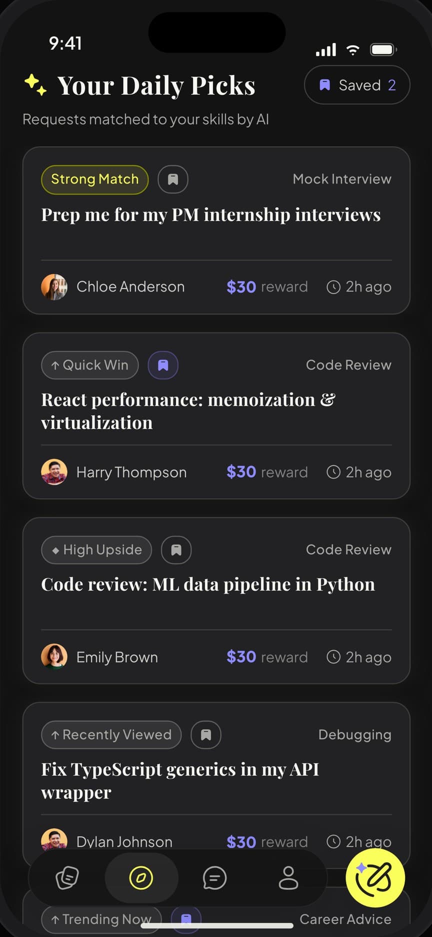
Daily Picks
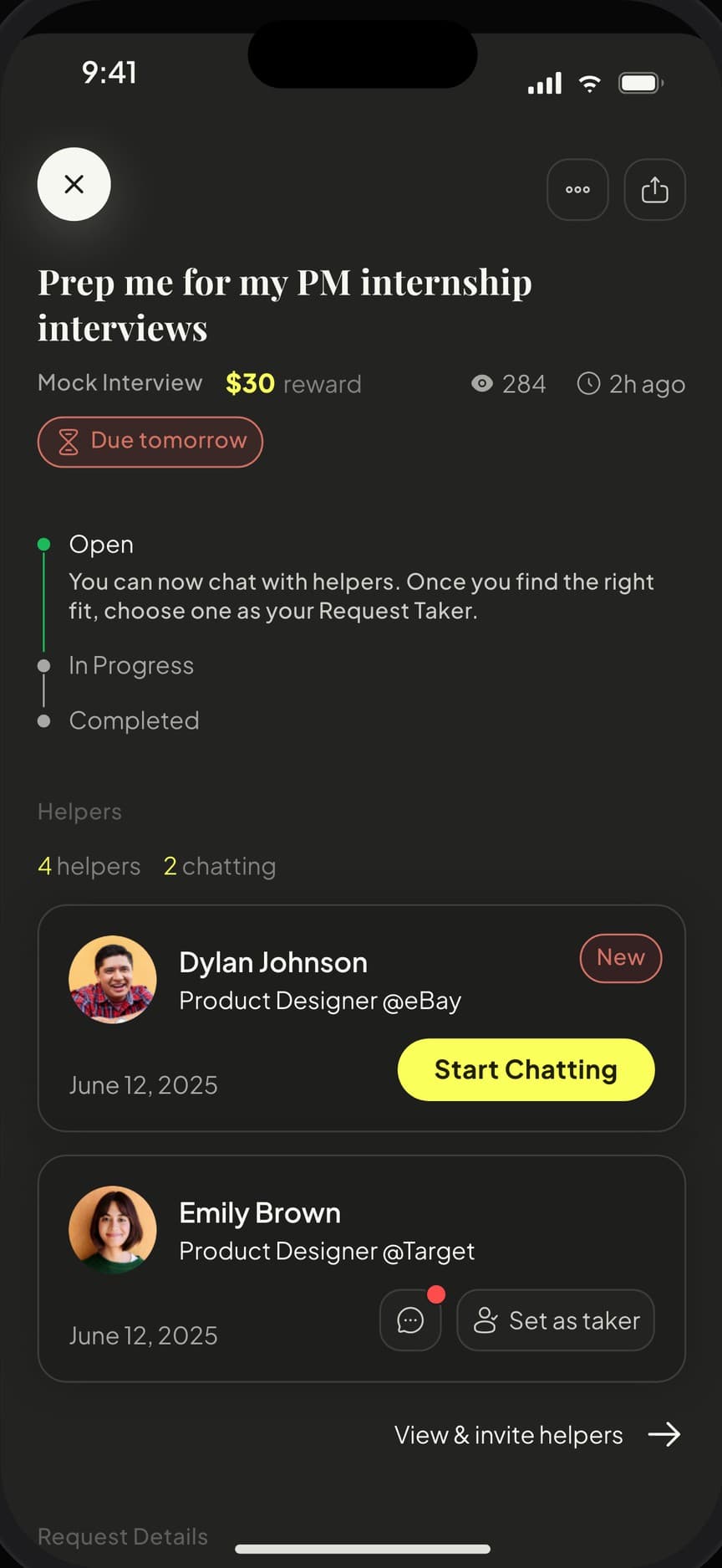
Request detail
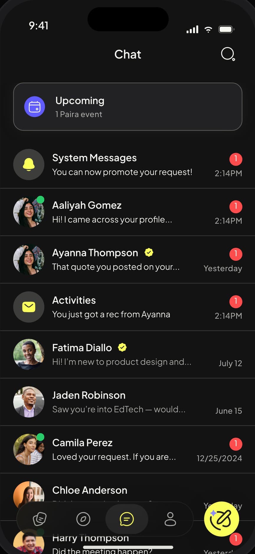
Chat
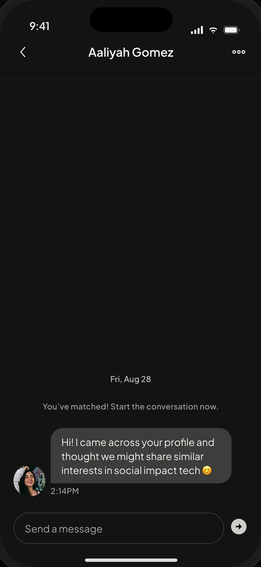
Conversation
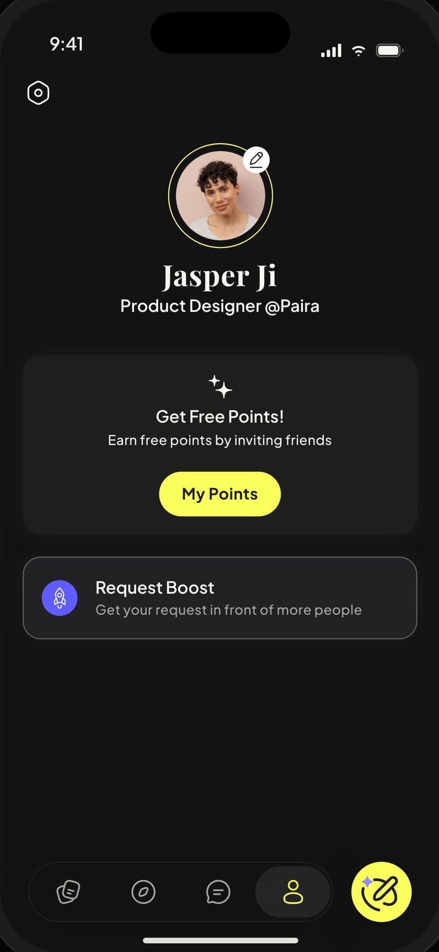
Profile
“We initially hired them for the UX/UI design of our new AI mobile app, but they provided so much more than expected. They took our concept from ‘zero to one’ flawlessly, optimizing the entire product architecture. Their service truly exceeded our expectations.”

Nick
Co-Founder of Paira
(04) Outcome
Zero to one, without the detours.
01
Coherent product
One architecture connecting the assistant, profiles and requests, instead of a set of disconnected screens.
02
Distinct look
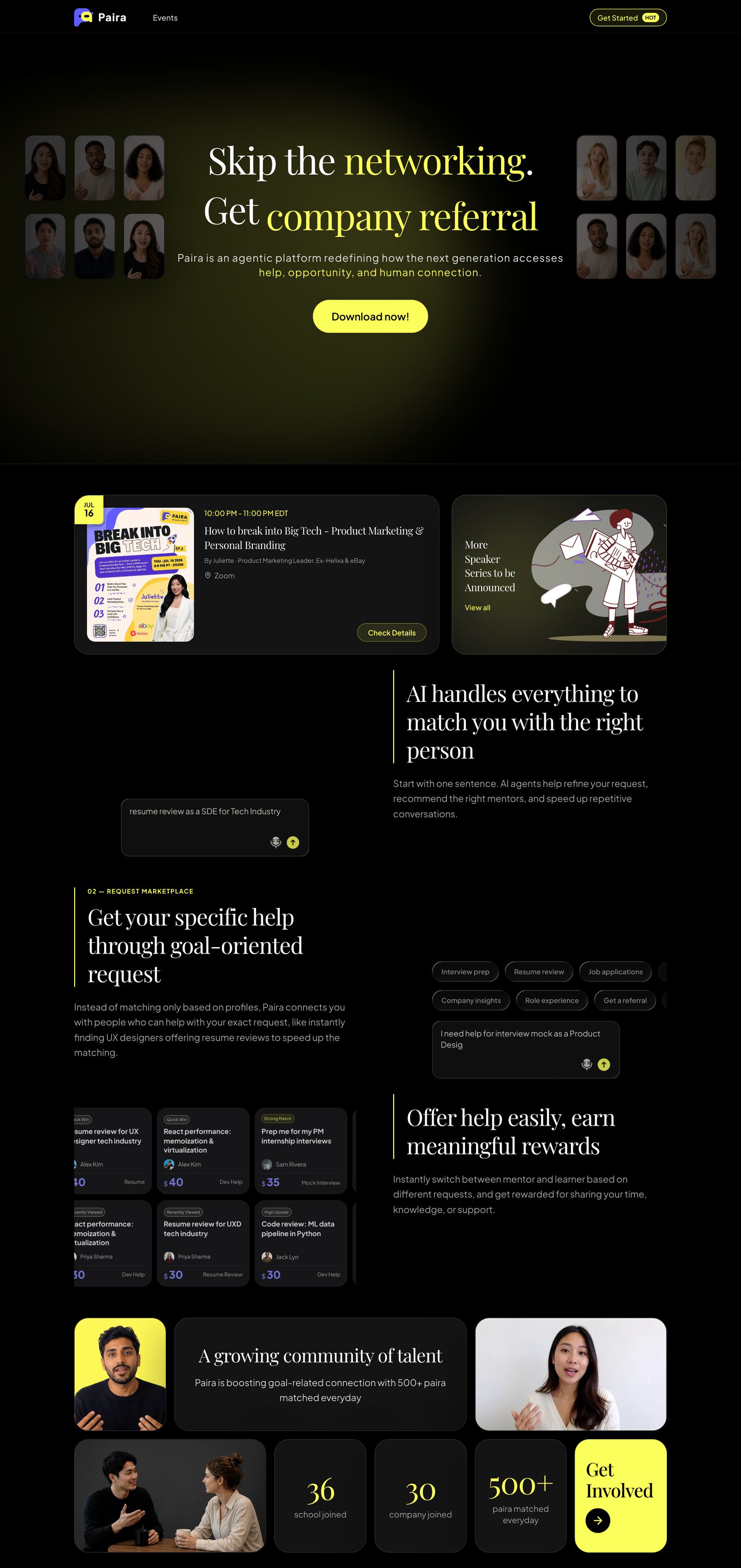
A dark, Gen Z visual language the brand now uses across app and marketing.
03
Ready to build
A component library and prototype handed off to engineering, with the in-house designers fully onboarded.